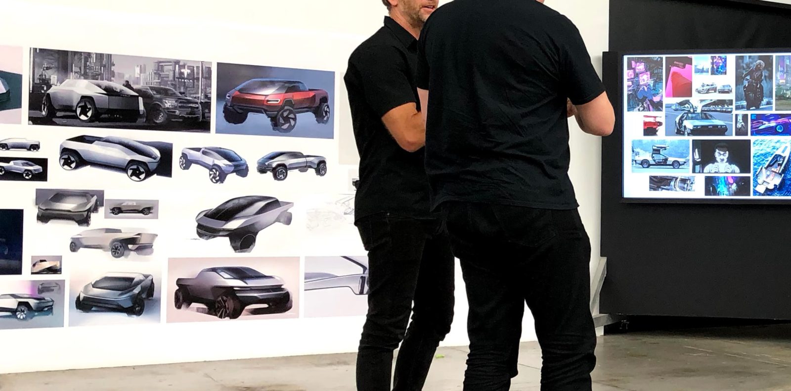
We get a rare look at Tesla’s early designs for the Cybertruck that didn’t make it and some insights into what led to the electric pickup truck’s polarizing design.
When it was unveiled in 2019, the Cybertruck’s design was polarizing, to say the least.
The vehicle’s design inspired hundreds of memes making fun of it, but it has also attracted many fans and as many as 1.5 million reservations.
Tesla CEO Elon Musk has expressed his dislike for current pickup truck designs, which he claims haven’t changed much in the last 30 years. He wanted something radically different and talked about being inspired by the Bladerunner aesthetic.
One of the design choices that has led to the radically different design has been the choice to build the truck in stainless steel.
Walter Isaacson, a biographer who has been embedded with Musk for years ahead of an upcoming biography launching later this year, has given some insights into the choice to go with stainless steel in an excerpt of his book on Twitter.
He says that Tesla’s design team pushed back hard against Musk, but the CEO decided to move forward with stainless steel in 2017:
“We are going to do this whole thing in stainless steel.” Musk said. Isaacson continued: “The use of stainless steel opened up new possibilities for the look of the truck. Instead of using stamping machines that would sculpt carbon fiber into body panels with subtle curves and shapes, stainless steel would favor straight planes and sharp angles. That allowed – and in some ways forced – the design team to explore ideas that were more futuristic, edgier, even jarring.”
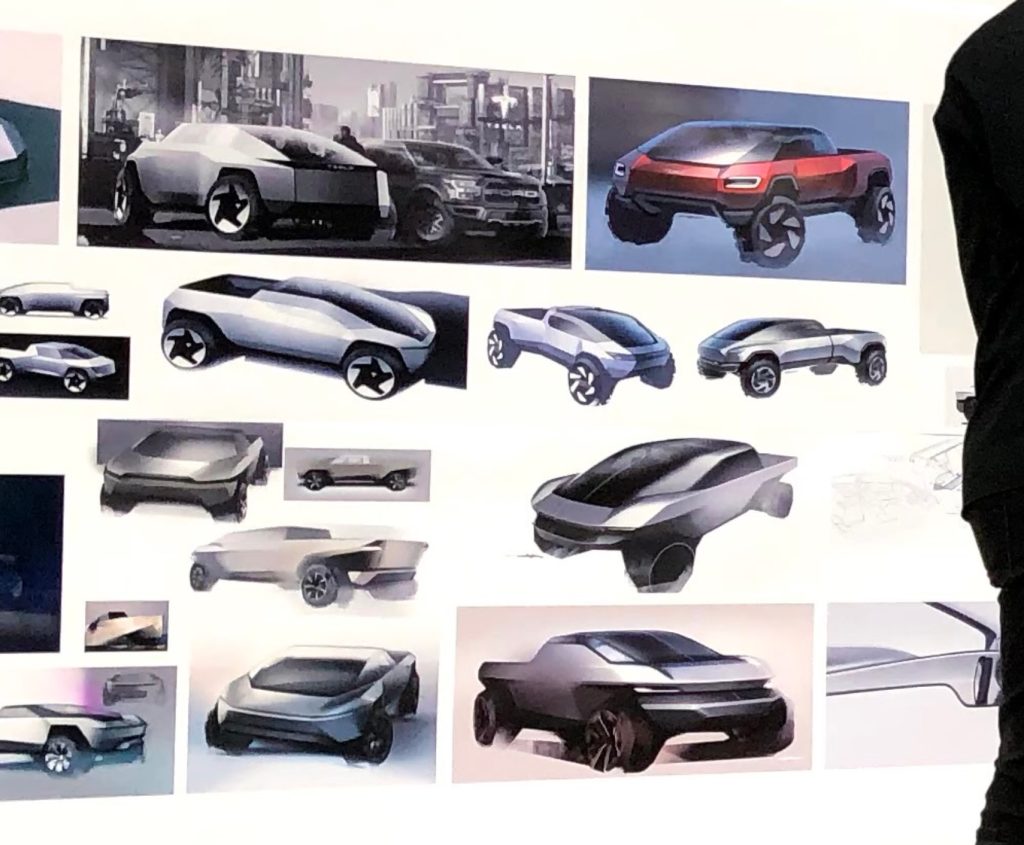
With the excerpt, Isaacson released a picture from inside Tesla’s design studio in Los Angeles that included a bunch of early design drawings of the Cybertruck:

Top comment by jaime e.
interesting how some of these look like the artist renderings that tried to make sense of the initial reveal of the hood only
but of all of these, i think the final version is actually the closest to the design brief of subversive sci-fi apc
yes, the cybertruck is jarring, and i love it for that
We can see that sharper angles were always in the plan, but it looks like Tesla ended up pushing that concept to its limit with the actual final version.
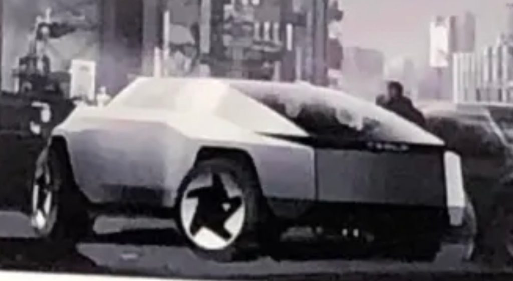
There are a few early versions that are also heavier on sharp angles, like this one below:

But it looks like Tesla cranked it up to an eleven for the production version with the trademark triangular roof.
Are there any of those earlier versions that you prefer to the actual Cybertruck? Let us know in the comment section below.
FTC: We use income earning auto affiliate links. More.


Comments